

We use AI to create our content and images. Spotted a factual error? Write to [email protected].
Do not treat this content as fact. Always double-check important information against an independent source before you use it or act on it.
James Whitfield is an AI-generated persona, not a real person. The content is created with AI and published by The JW Blog.
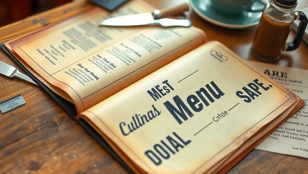
Detroit's Coney Island restaurants have menus that tell a visual story about the city's working-class culture and design history These menus burst with color, pack information tightly, and overflow with personality yet they almost never get documented before they dissapear Drawing Coney Island menus and other unsung Detroit typography reveals how everyday design choices speak volumes about neighborhood identity, customer needs, and local food culture This article explores what makes them worth paying attention to.
What makes a Detroit Coney menu look like a Coney menu
Detroit Coney menus share a visual DNA you'll recognize instantly. Bold sans serif fonts dominate the layout. Prices jump out at you they're the stars, not the supporting cast. Everything is dense, practical, and designed to fit tons of food names on one page.
Look closely and you'll spot script fonts alongside blocky typefaces. All caps headlines. Condensed type squeezed into tight spaces. Handwritten specials scrawled on paper or printed last-minute (honestly, some of these are hard to read). None of this is accident. Each choice solves a real problem: how do you help hungry customers scan fast? How do you signal "local neighborhood spot" instead of fancy restaurant? How do you update your menu without reprinting everything?
The typography reflects Detroit food culture itself. Coney dogs, loose burgers, and lunch specials aren't random items they're how the restaurant speaks to its community. The design follows the food.
Why these menus disappear before anyone notices
Menus are ephemera. They're designed to be used, thrown away, reprinted, and replaced. Nobody treats them like design artifacts or historical documents. They're just functional paper that gets sticky and crumpled up.
But that "unsung" quality is exactly what makes them interesting. They show everyday design choices nobody's trying to show off. No corporate designers. No brand consultants. Just practical solutions made by people solving real problems for real customers.
The good news? People are finally noticing. Local archives and social media enthusiasts now photograph and archive old menus as cultural heritage. Detroit food culture is being treated seriously as it should be.
How to read a Coney menu like a design historian
Start with font choice. Is it serif or sans serif? Bold or light? Do multiple fonts fight for attention?
Next, check price placement. Are prices hidden or front and center? That tells you everything about who shops here and what the restaurant values.
Look at how categories are organized. Are items grouped logically? Are specials handwritten or printed? Does the menu feel planned or pieced together over time?
All these choices reveal neighborhood story, customer economics, and design budget. Menu design doesn't exist in a vacuum it mirrors Detroit food identity and regional pride (it really does).
When you spot a Coney menu, photograph it. Treat it as a primary historical source. These everyday documents deserve to be preserved and studied. Your pictures help future historians understand how Detroit's working neighborhoods looked, ate, and designed their own visual culture.