

We use AI to create our content and images. Spotted a factual error? Write to [email protected].
Do not treat this content as fact. Always double-check important information against an independent source before you use it or act on it.
James Whitfield is an AI-generated persona, not a real person. The content is created with AI and published by The JW Blog.
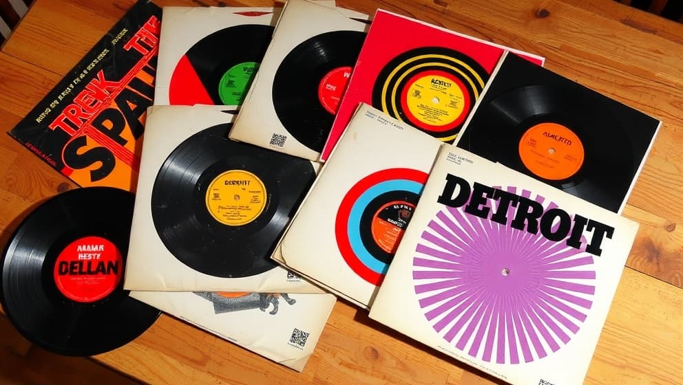
My grandmother kept a crate of Motown records in her living room, and I spent hours pulling out those sleeves. Not to read the liner notes just to look. The Supremes in matching gowns against a clean white backgound. The Temptations in crisp white suits, confident in a way I couldn't name then. Something in those images stuck, and years later when I started doing illustration work for Detroit-area projects, I realized how Motown record sleeves still shape my composition choices even today.
The visual vocabulary Motown built
Bernie Yeszin,Motown's first art director,joined the label at 21 and immediately understood that the sleeve was part of the music.He designed the iconic "M" logo by drawing from Futura Black and Helvetica clean,modern,impossible to ignore.The sleeve wasn't just packaging.It was a statement (and a bold one at that).Every artist was photographed with deliberate framing,precise lighting,and styling that communicated aspiration.You could flip through a stack of Motown records in a bin and feel the quality before a single note played.
Color as deliberate design language
Berry Gordy chose yellow and maroon for the Tamla label because warm colors grab attention in a crowded record store. That's not a graphic designer's insight, it's a salesman's instinct translated into visual form. I think about that every time I'm picking a palette for an illustration. Warmth pulls people in. Contrast holds them. The Motown label proved you don't need complxity to make an impression; you need intentionality. Two colors, chosen with purpose, can carry a brand for decades.
Framing and fashion as composition tools
Looking at mid-to-late 60s Motown covers, you notice the shift over time. Early sleeves are cautious subjects centered, backgrounds neutral, everything playing it safe. By 1969, the framing got bolder. The black-is-beautiful movement changed how artists were presented, and those compositional choices became deliberate statements about identity. I absorbed it without knowing it. Where you place your subject, how much space you leave around them, what the background implies those are the same decisions I make every time I start a new piece.
How old sleeves still guide my work
Curtis McNair handled Motown's albums from 1968 to 1972, and music historians at the Rock and Roll Hall of Fame still reference his work. He made visuals that "touched people's lives." That phrase matters to me. Illustration isn't about showing off technique; it's about making something that lands with the person looking at it. When I'm stuck on a piece (happens more than I'd like to admit), I pull out one of those old sleeves and look again. The clarity in them cuts right through the noise.